22 Feb Keeping Your Medical Device GUIs Healthy
Have you ever interacted with a touchscreen while wearing latex gloves? Most people interact with multiple display screens in their daily lives. However, there is more to designing a graphical user interface (GUI) for a medical device then applying best practices of UX and UI. Gloves are but one factor that must often be considered.
For one, medical device GUIs must aspire to the highest levels of accessibility and usability to guarantee safety. Many times, they are providing real-time info monitoring critical situations (heart rates, blood pressures, oxygen levels, etc.). Design shortcomings could lead to consequences that are often more severe than in other industries. While the outcome of a bad retail website may be a lost customer or ordering the wrong meal, if a similar difficulty presents itself in a medical GUI, the effect could seriously harm a patient or user. Moreover, medical GUIs require a deep understanding of the user and use environment – not just the tech. Users are often performing complex tasks under highly stressful situations, and the industry is vast and diverse. Software can fit into a clinic, home, ambulance, or app and users can range from inexperienced to specialized doctors, nurses, lab techs, pharmacists, or even lay people. Imagine a fifty-something neurosurgeon using brain imaging software in a hospital’s operating room versus a college student using an app to track their blood sugar levels on their way to class. While both interact with displays, they each have unique situational, environmental, and cognitive differences that will impact how they engage with and experience the software. Finally, as a component of medical device interfaces, GUIs are subject to regulatory standards and often must comply with FDA expectations. Based on the device or system’s critical tasks, risk analysis documentation and formative evaluations specific to the GUI could be required.
Key Tech’s GUI development process addresses these unique industry considerations in three phases. Ensuring designs are implementable, Key Tech computer engineers and software developers are involved from the start.
- Foundation
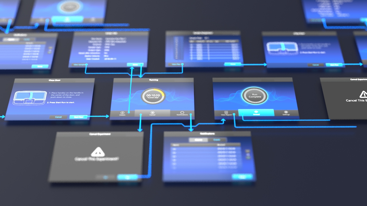
The first step is gathering the functional and technical requirements. This includes assembling a list of the tasks required to accomplish the goals of the device and defining the operating system (pixel density, display size, viewing angle, etc.). Next, a use analysis is performed for establishing critical stages within the GUI workflow. The users of the system are researched by observing how they perform the tasks and how the design must support their goals. If observing is not possible, interviews can be conducted to collect firsthand accounts and background. These findings contribute to the development of an information architecture: a visualization of the structure and organization of the system. Many times, this will be a ‘living’ chart that continues to evolve until the end of the design phase. Prototyping is the next important step, in which the team ideates, experiments with, and brings concepts to life – allowing walkthroughs and exploratory interaction. ‘Quick and dirty’ prototypes are often most valuable at this stage of the design process. The goal is to get ideas in front of users, stripped of all aesthetic look or feel, allowing them to focus on functionality without distractions. Lastly, there is a usability inspection. This is ideally completed by an end user and is meant to discover problems and identify issues.
- Design
Once a prototype/workflow has been properly evaluated, creating a high-fidelity wireframe that includes art direction and tactical feedback becomes more useful. It is especially important to consider ergonomics data, accessibility, and how humans process information in this phase. Design choices should account for extreme ranges of ability. Touchpoints should be made large enough for different finger sizes and dexterities (and sometimes gloves!). Existing design conventions, distinguishable button states, and visual hierarchies can provide clarity and cut down on uncertainties as users move through screens. Color and typography choices should align with aesthetic and brand direction while ensuring readability and ultimately usability. Careful consideration is taken to ensure color coding and contrasts alone are not used to express important information. This not only helps color blind people, but also aids understanding by normally sighted people by providing them with multiple reinforcing cues. A dial that includes shape, texture, and icon distinctions will ultimately be more usable than a dial that relies only on color differences. Simple language, meaningful headings, and subheadings allow for scanning and provide clarity. Long sentences and paragraphs should be avoided. Finally, it is essential that the design is consistent to avoid operating confusion. On-screen behaviors and elements like buttons, indicators, and text entry fields should be shared and familiar between screens.
- Documentation
The final phase includes completing documentation of the design and decisions made along the way as well as implementing the design in software. Designers work alongside developers to ensure screens are executed to their original design intent.
The overall success of a medical device is often linked to the UI, and therefore, the GUI is a critical component. With continuous technological advancements (AR and VR, cross-device ecosystems, etc.) and the consumerism of healthcare (at-home medical devices and wearables), GUIs will only become a more widespread and integral part of medical device development.

Alli is a native of Milwaukee, WI and graduated from the University of Cincinnati with a BS in Industrial Design and a Minor and Business Certificate in French. Prior to Key Tech, she designed watches for Fossil Group in Dallas, TX. When not designing, she can be found listening to live music, making travel plans, or hanging out with her cat Disco.
- AI in Design Workflows: Exploration to Application - May 28, 2026
- AI as a Creative Design Partner - August 20, 2025
- Rx for Excellence: Leveraging Workflow Pain Points - May 28, 2024